ShopDreamUp AI ArtDreamUp

Deviation Actions


Description
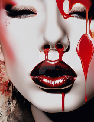
...this is the key to my heart...
- - -
An experiment that I began about a month ago but just found time to finish. I wanted to try out white skin, or something like that.
It's actually a small manip (1500x1500px, 300dpi) but took a long time because I couldn't paint/manip the blood right. It still looks odd. I tried out several blood-painting tutorials but still couldn't do it so I had to use brushes. *sigh*
Oh, and I know that you're going to ask "Is this about sex?" The answer is, well, yes. But I didn't really mean it. At first, I was merely portraying heartbreak but along the way, I felt like the key concept was appropriate.
Please critique and tell me how to improve on the pearls. They look odd. I want to fix them (Smile)")
~dust-stock | *unholy-stock | ~TrapDoor-Stock | ~anamarianthony
Okay, I swear, this is my last submission for a while
- - -
An experiment that I began about a month ago but just found time to finish. I wanted to try out white skin, or something like that.
It's actually a small manip (1500x1500px, 300dpi) but took a long time because I couldn't paint/manip the blood right. It still looks odd. I tried out several blood-painting tutorials but still couldn't do it so I had to use brushes. *sigh*
Oh, and I know that you're going to ask "Is this about sex?" The answer is, well, yes. But I didn't really mean it. At first, I was merely portraying heartbreak but along the way, I felt like the key concept was appropriate.
Please critique and tell me how to improve on the pearls. They look odd. I want to fix them
~dust-stock | *unholy-stock | ~TrapDoor-Stock | ~anamarianthony
Okay, I swear, this is my last submission for a while
Image size
800x800px 256.36 KB
© 2007 - 2024 cryingsorceress
Comments59
Join the community to add your comment. Already a deviant? Log In
How you doing white skin?